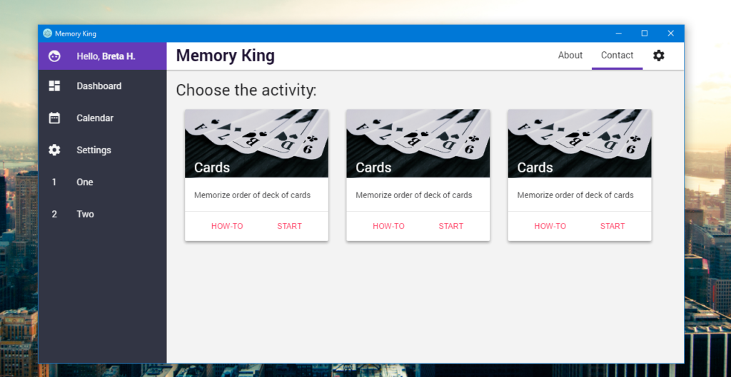
Third blog post from the chellenge series and still going. Today we will be looking on user interface and some design related stuff. Nobody cares about the stuff you programmed as long as you don’t give a cool GUI to it. And that’s the reason why I like to start with it. Because it will look like a lot of work has been done ?.
As you can see, this is only screenshot of the prototype. Yes, I am on the Windows right now #DontJudgeMe. But before we dive into the design. I want to give you one quick electron devtip.
If you decidet to use Material Icons (my favorite), NEVER EVER import them using npm or bower. It imports whole repository which includes so many files that the electron packager freezs.
Programmer != Graphic Designer
If you remember only one thing from this blog post, it should be this. Programmer isn’t graphic designer. You should know this whenever you want some graphic related stuff from the programmer. But also programmers should keep this in mind. There may be people who are good in both, but that will be only exceptions. The truth is that the taste of programmers isn’t same as the taste of daily users (as long as you don’t create tools for programmers).
For example, I have this problem that whenever I try to design something. I feel that something is wrong, but I can’t tell what and how to correct it. That’s the reason why GUI of the Memory King is based on the material design. Which wasn’t the best idea, because the material design doesn’t look so good on a computer as on a mobile.
First Time with Sass
How could I live without that? Seriously, I love it. Since this was my first time using sass, I decided to use scss syntax because it is very similar to the css syntax. My most favorite features are variables, nesting and mixins. And there is still a lot more to explore. I found really helpful this guide. Also the feature of using partial files is really nice. I make my file structure similar corresponding to react:
styles/
|
|-- abstracts/              # Presets used by other files
|   |-- _colors.scss
|   |-- _mixins.scss
|   |-- _variables.scss
|   ...
|
|-- components/             # Components corresponding to react
|   |-- _header.sass
|   |-- _sidebar.scss
|   |-- _content.scss
|   |-- _scrollbar.scss
|   ...
|
|-- layout/                 # Control the whole structure
|   |-- _layout.scss
|   ...
|
|-- typography/
|   |-- _typography.scss
|   ...
|
`-- main.scss               # Primary Sass file, imports all partials
You can find different file structures across the web, but most important is to stick to one system and stay consistent.
Summary
Sass is awesome. There is still a lot to do. And I forget to tell you how much time saves the live reloading feature from previous blog. I hope that I will start working on some functionalities during the next week. And I would also love to release the logo of the project in the next blog post.


1 Pingback